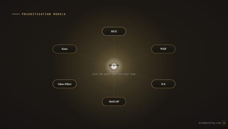
A prioritization matrix is the most accessible entry point into structured product decision-making. Unlike scoring frameworks that require calibrated inputs and mathematical formulas, a matrix provides a visual, intuitive way to compare features across two or more dimensions. You plot features on a grid, identify which quadrant they fall into, and use the quadrant to guide your decision: build now, schedule for later, investigate further, or decline.
The challenge is choosing the right matrix for your context. A solo PM at a startup needs a different tool than a product leader managing five teams. A team with rich customer data can use a more sophisticated matrix than a team operating on intuition. And a team that has adopted AI-powered scoring can use matrices that would be impractical to maintain manually. This guide presents five prioritization matrices, each designed for a different context, with templates you can adopt immediately.
Matrix 1: Value vs Effort (The Universal Starter)
The simplest and most widely used prioritization matrix plots features on two axes: expected value (high to low) and estimated effort (low to high). The four resulting quadrants create a clear action framework. Top-left (high value, low effort) contains Quick Wins — features that should be prioritized immediately because they deliver significant value with minimal investment. Top-right (high value, high effort) contains Big Bets — features worth pursuing but requiring careful planning and resource commitment. Bottom-left (low value, low effort) contains Fill-Ins — features that can be built during slack time but should not displace higher-value work. Bottom-right (low value, high effort) contains Money Pits — features that should be declined or fundamentally reconceived.
Best for: teams of any size that need a quick, visual prioritization exercise. Especially useful for initial triage of a large backlog or for facilitating alignment in stakeholder workshops where participants are not comfortable with quantitative scoring frameworks.
Limitation: both axes are subjective. Two team members may place the same feature in different quadrants. Features cluster in the center of the grid rather than falling into clean quadrants. The matrix is better for conversation than for precise ranking.
Matrix 2: RICE Scoring Grid
The RICE matrix extends the basic 2×2 by incorporating four dimensions: Reach, Impact, Confidence, and Effort. Each feature is scored on all four dimensions, and the RICE formula produces a composite score that determines placement on a sorted list or a score-vs-effort scatter plot.
The RICE grid is typically displayed as a table with features in rows and RICE components in columns, plus a calculated score column. Features are sorted by score descending, and the PM draws a capacity line — everything above the line fits in the sprint or quarter, everything below is deferred.
Best for: growth-stage teams with moderate data maturity. RICE requires reasonable estimates for reach (how many users are affected) and impact (how much each user benefits), which presumes some level of analytics or feedback data. Teams without this data will produce RICE scores that are no more reliable than the Value vs Effort matrix.
Matrix 3: Strategic Alignment Matrix
The Strategic Alignment matrix plots features on two axes: customer demand (measured by signal volume, feedback frequency, or vote count) and strategic alignment (measured by how directly the feature supports active business objectives). The four quadrants reveal different investment profiles. High demand + high alignment features are the core roadmap — strongly validated and strategically important. High demand + low alignment features require investigation — customers want them, but they do not advance the stated strategy. Low demand + high alignment features are strategic bets — the team believes they are important even without strong customer evidence. Low demand + low alignment features are deprioritized.
Best for: teams that have defined strategic objectives (OKRs) and want to ensure their roadmap reflects both customer evidence and strategic direction. Particularly useful for identifying features that are popular but strategically tangential — a common source of roadmap drift.
Matrix 4: Customer Impact Matrix
The Customer Impact matrix plots features on two axes: breadth of impact (how many customers are affected) and depth of impact (how severe the problem is for each affected customer). This matrix is uniquely valuable for identifying features that affect a small number of customers intensely versus features that affect many customers mildly.
High breadth + high depth features are urgent priorities — many customers experiencing severe pain. High breadth + low depth features are quality-of-life improvements — many customers with minor friction. Low breadth + high depth features are targeted investments — a few customers with critical needs (often enterprise accounts with high revenue value). Low breadth + low depth features are noise — safely deprioritized.
Best for: teams with multi-channel feedback data that can measure both the number of unique requestors (breadth) and the severity of their reported pain (depth). AI-powered platforms that consolidate feedback from multiple channels and score sentiment provide both inputs automatically.
Matrix 5: AI-Enhanced Scoring Matrix
The most sophisticated matrix replaces subjective axis placement with AI-calculated scores. The x-axis is the AI Priority Score (a composite of signal strength, strategic alignment, feature completeness, and sentiment intensity). The y-axis is effort (estimated by AI using historical velocity data and feature complexity indicators). Each feature is plotted automatically based on its current data, and the plot updates as new signals arrive.
This matrix eliminates the manual scoring exercise entirely. The PM reviews the plot, investigates features that seem misplaced (which indicates a data gap or an AI assessment worth challenging), and uses the visual to communicate priorities to stakeholders. The dynamic nature means the matrix is always current — no quarterly re-scoring sessions required.
Best for: teams using AI-native PM platforms with evidence-based scoring and persistent product context. Requires sufficient feedback data flowing through the pipeline to generate reliable scores.
Choosing the Right Matrix
If you are a solo PM with no data infrastructure, start with Value vs Effort. It requires no tooling, produces useful results in thirty minutes, and builds the prioritization muscle that supports more sophisticated approaches later. If you have moderate data (feedback from two or more channels, basic analytics), move to RICE or Strategic Alignment. If you have rich data flowing through an AI pipeline, the AI-Enhanced matrix provides the most reliable and least time-consuming prioritization.
The most effective teams evolve through these matrices as their data maturity increases, rather than starting with a complex framework they cannot populate accurately. Start simple. Add sophistication as data justifies it.
| MindBacklog provides the AI-Enhanced scoring matrix automatically — every feature plotted by evidence-based priority score and effort estimate. No manual scoring. Always current. Start your free trial at mindbacklog.com. |
Ready to put your product intelligence on autopilot? Start your 14-day free trial at MindBacklog.com — no credit card required.