Feature prioritization surveys are one of the most powerful and most misused research tools in product management. When designed correctly, they provide statistically grounded input on customer preferences that no other method can match at scale. When designed poorly — which is the norm — they produce data that is misleading, biased, and sometimes worse than no data at all. The difference between a useful survey and a useless one comes down to question design, respondent selection, and analysis methodology.
Why Most Prioritization Surveys Fail
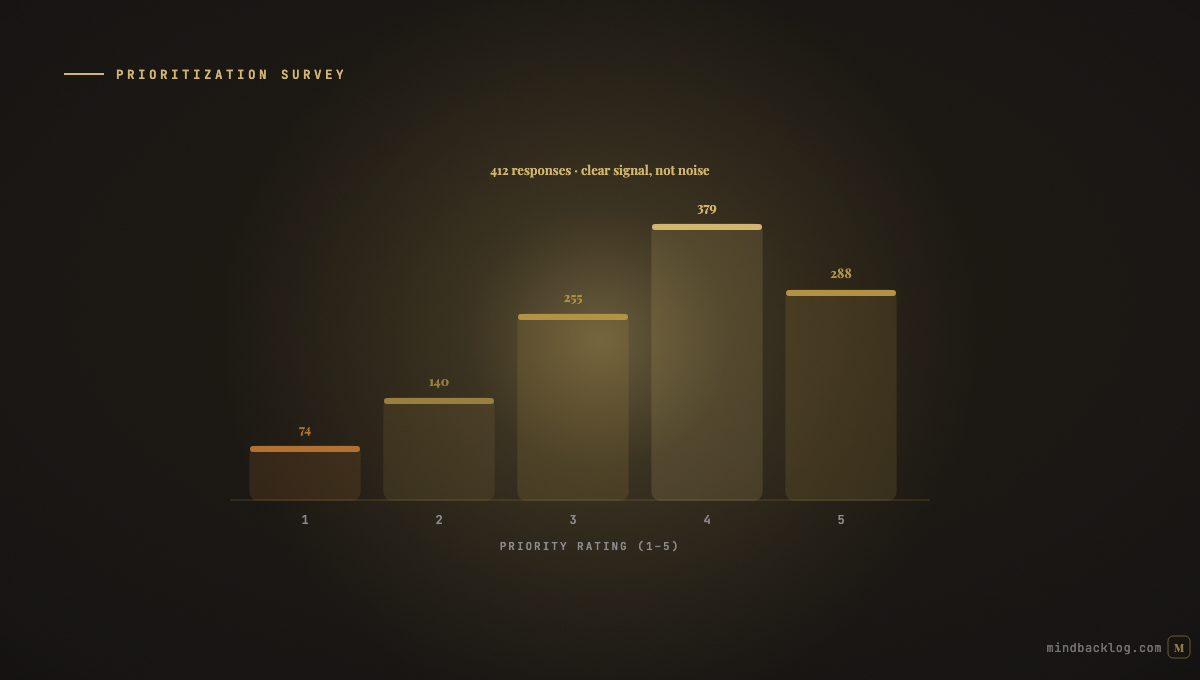
The most common survey design is a list of features with a ‘rate the importance’ scale (1-5 or low/medium/high) next to each one. This design fails because it does not force tradeoffs. Respondents rate everything as ‘important’ because nothing prevents them from doing so. The result is a flat distribution where every feature scores 3.5 to 4.5, and the PM learns nothing actionable.
The second common failure is respondent self-selection bias. The customers who complete a prioritization survey are the most engaged, most opinionated segment — not a representative sample of the full customer base. Their preferences may diverge significantly from the silent majority.
Three Survey Formats That Actually Work
MaxDiff (Maximum Difference Scaling) presents respondents with sets of four to five features and asks them to choose the most and least important in each set. Respondents see multiple sets with different combinations. The statistical analysis produces a robust importance ranking that forces tradeoffs and resists the ‘everything is important’ bias. MaxDiff is the gold standard for feature prioritization surveys.
Pairwise comparison presents two features at a time and asks ‘which is more important to you?’ Respondents make a series of binary choices, and the results are aggregated into a ranked list using algorithms like Bradley-Terry. This format is simpler than MaxDiff but requires more comparisons to cover the full feature set.
Allocation-based surveys give respondents a fixed budget (100 points, or play money) to distribute across features. This forces explicit tradeoffs — allocating 30 points to one feature means 30 fewer points for everything else. The allocation reveals true preferences because the scarcity constraint makes every choice meaningful.
Combining Survey Data With AI Scoring
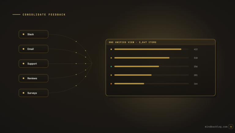
Survey results are one input to prioritization, not the complete picture. Customer preferences (what they say they want) should be combined with behavioral data (what they actually do), feedback evidence (the problems they describe), and strategic alignment (what the business needs). AI-powered scoring systems can incorporate survey data as an input alongside signal volume, sentiment analysis, and objective alignment — producing a composite score that reflects both expressed preferences and observed behavior.
This combination is more reliable than either source alone. Surveys capture stated preferences with statistical rigor. AI feedback analysis captures revealed preferences with contextual depth. Together, they provide a more complete picture of customer needs than either method independently.
| MindBacklog combines survey-style voting portal data with AI feedback analysis from 8 channels — giving you both stated and revealed customer preferences in one scoring framework. Start at mindbacklog.com. |
Ready to put your product intelligence on autopilot? Start your 14-day free trial at MindBacklog.com — no credit card required.