Most product backlogs are organized by feature or by priority rank — a flat list where items are ordered from most important to least important. This ordering is useful for sprint planning but terrible for release planning, because it provides no information about whether a given set of features delivers a coherent user experience. You might build the ten highest-priority items and discover that they cover three stages of the user journey deeply while leaving two stages completely unaddressed. The result is a release that is impressive in some areas and broken in others.
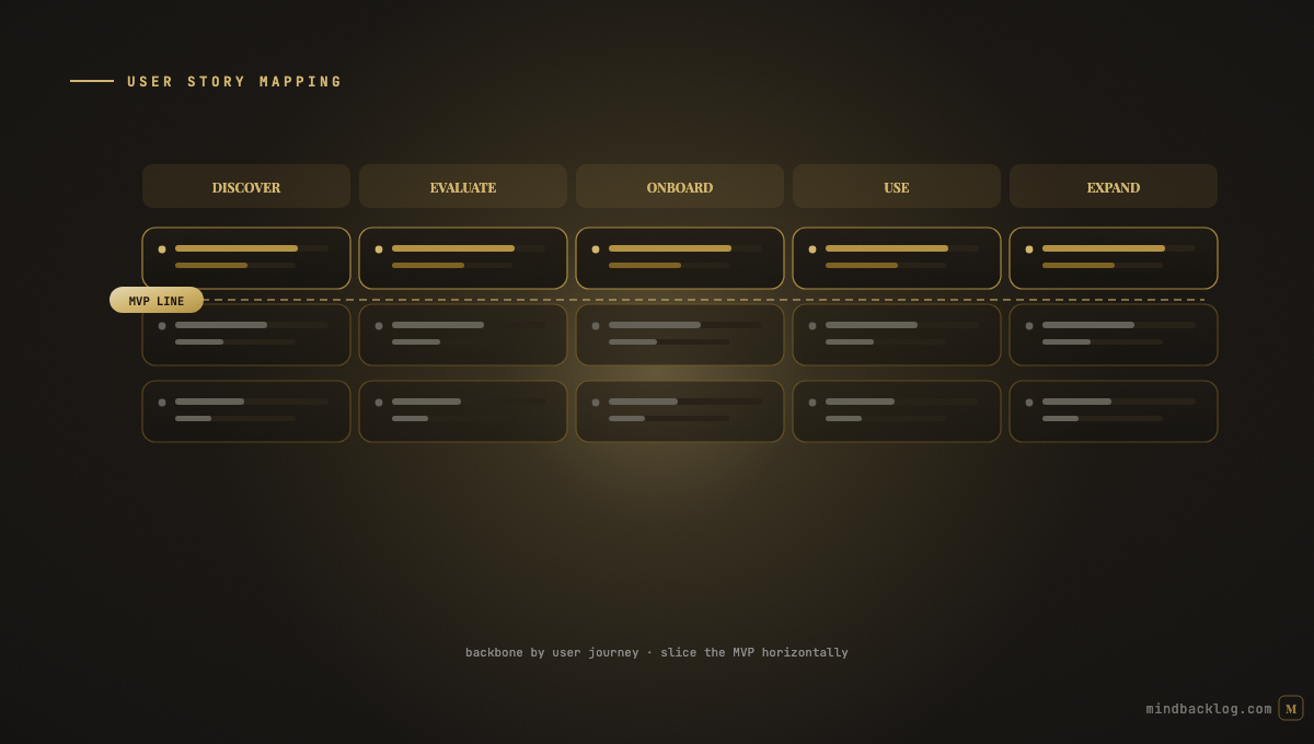
User story mapping, introduced by Jeff Patton, solves this by organizing the backlog along two dimensions simultaneously: the user journey (horizontal) and story depth (vertical). The horizontal axis represents the sequence of activities a user performs — from discovery through onboarding, daily use, and expansion. The vertical axis represents the depth of each activity — from the essential minimum at the top to the rich, polished experience at the bottom. Releases are planned as horizontal slices across the map, ensuring that each release delivers a consistent level of experience across the entire journey.
Building the Map
A story map is built in four layers. The backbone is the top row: the major user activities arranged in the order they are performed. For a SaaS product, this might be: Discover Product → Create Account → Set Up Workspace → First Key Action → Daily Workflow → Team Collaboration → Expansion/Upgrade. This backbone represents the complete user journey from awareness to expansion.
Beneath each backbone activity, add the specific user tasks that comprise that activity. Under ‘Set Up Workspace,’ the tasks might include ‘Name workspace,’ ‘Invite team members,’ ‘Configure settings,’ and ‘Import existing data.’ These tasks are more granular than the backbone activities but more abstract than user stories.
Beneath each task, add user stories arranged vertically by priority — the most essential stories at the top, progressively less essential stories below. The top row of stories across all tasks represents the minimum viable experience. The second row adds depth. The third row adds polish. Each horizontal slice is a potential release.
The complete map gives the team a visual representation of the entire product experience, organized by journey stage and depth. It immediately reveals gaps — stages with few stories, tasks with no essential stories, or releases that leave entire journey stages unaddressed.
Planning Releases With Story Maps
The most powerful application of story mapping is release planning. Draw a horizontal line across the map at a given depth level. Everything above the line is in the release. Everything below is deferred. The line ensures that the release delivers a consistent level of experience across every journey stage — no stage is deeply developed while another is completely missing.
The first release slice (MVP) should include only the stories in the top row — the minimum viable version of each journey stage. This ensures that the first release is a complete, if basic, end-to-end experience. Users can perform every essential activity, even if none of them are deeply developed yet. This is dramatically better than a release that has deep functionality in one area but no functionality in another.
Subsequent release slices add depth: better error handling, more configuration options, advanced workflows, and polish. Each slice makes the product better across the entire journey rather than adding isolated features that serve one stage while ignoring others.
Story Mapping Workshops
Story mapping works best as a collaborative workshop with PM, engineering, and design. The workshop follows the four-layer construction: define the backbone (30 minutes), add tasks (30 minutes), add stories (45 minutes), and draw release slices (30 minutes). Total time: two to two and a half hours for a meaningful product scope.
Use physical sticky notes on a wall for the workshop — the tactile manipulation of stories is faster and more collaborative than digital tools. Photograph the map afterward and transfer it to your digital backlog. The map serves as the architectural blueprint; the digital backlog manages execution.
Revisit the story map quarterly to update it as the product evolves. New stories are added, completed stories are marked, and the release slices are adjusted based on actual progress. The map becomes a living representation of the product’s journey coverage.
Combining Story Maps with Evidence-Based Prioritization
Story mapping provides the structural organization (what experiences need to exist). Evidence-based prioritization provides the investment weighting (which experiences need the most depth). Combining both means the PM knows which journey stages to prioritize for depth investment based on customer feedback, usage data, and strategic objectives.
If customer signals indicate that the onboarding stage is causing the most pain, the story map shows exactly which stories in the onboarding column should be built next. If usage data shows that the daily workflow stage has the highest engagement, deepening that stage may drive the most retention value. The story map provides the canvas. The evidence provides the paint.
|
MindBacklog organizes features by product areas that map to your user journey stages, with AI-generated stories and evidence-linked priorities. Structure meets intelligence. Start at mindbacklog.com. |
Ready to put your product intelligence on autopilot? Start your 14-day free trial at MindBacklog.com — no credit card required.